Best viewed on desktop

Brand guidelines 2024
MADE began in 2010, when our founders struggled to find seriously stylish pieces for their homes, at a price they loved. Their mission was to make high-end design accessible to the masses. All these years on, and design is still at the heart of what we do. We’re all about making brave choices and disrupting the traditional furniture market. You’ll find new favourites and cult classics from the minds of MADE’s in-house and independent designers. We work with a wide network of collaborators, manufacturers and industry experts to bring our amazing products to life, offering customers high-end furniture without the high-end price tag. All MADE collections are available to shop at made.com.
If MADE.COM was a person, they’d be the Interior Designer Next Door. They understand how personal home are, and want to help people express themselves through their style choices.

Obsessive about design, they’re on a mission to share their expertise and spark inspiration. A natural trend-setter, they have an encyclopaedic knowledge of designers, artists and cultural references.

And they live next door. You’re on first name terms. They’re easy to talk to - never elitist or cold.

That’s how MADE sounds.
Overview

The logo is a brand symbol. It’s a combination of the screwhead icon and the wordmark. We use MADE for OOH marketing and campaigns, emails, website and social channels.

Space

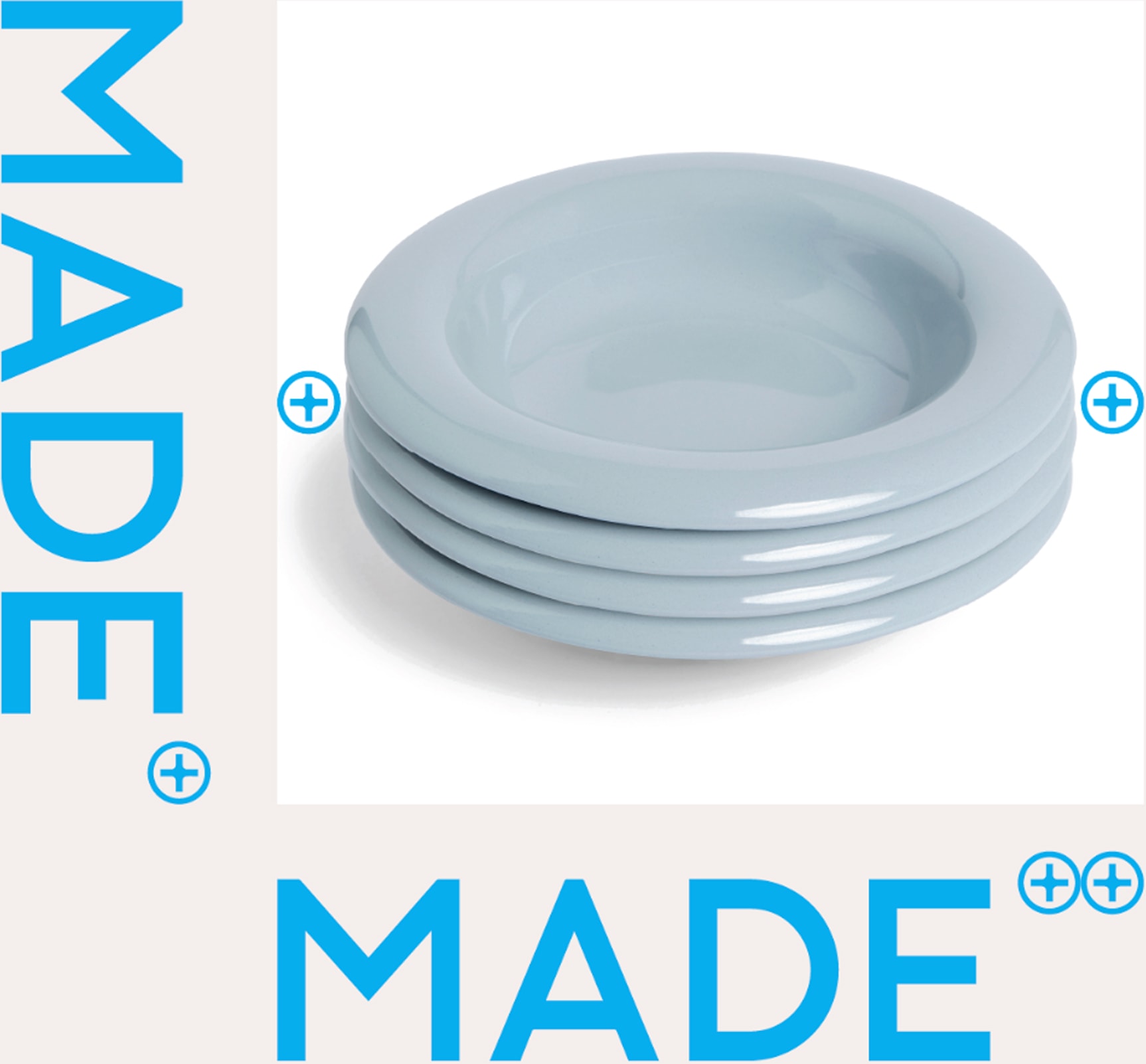
The logo should have a space at least equivalent to its height above and below it, and either side should have a minimum space equivalent to the width of the M.
Placement

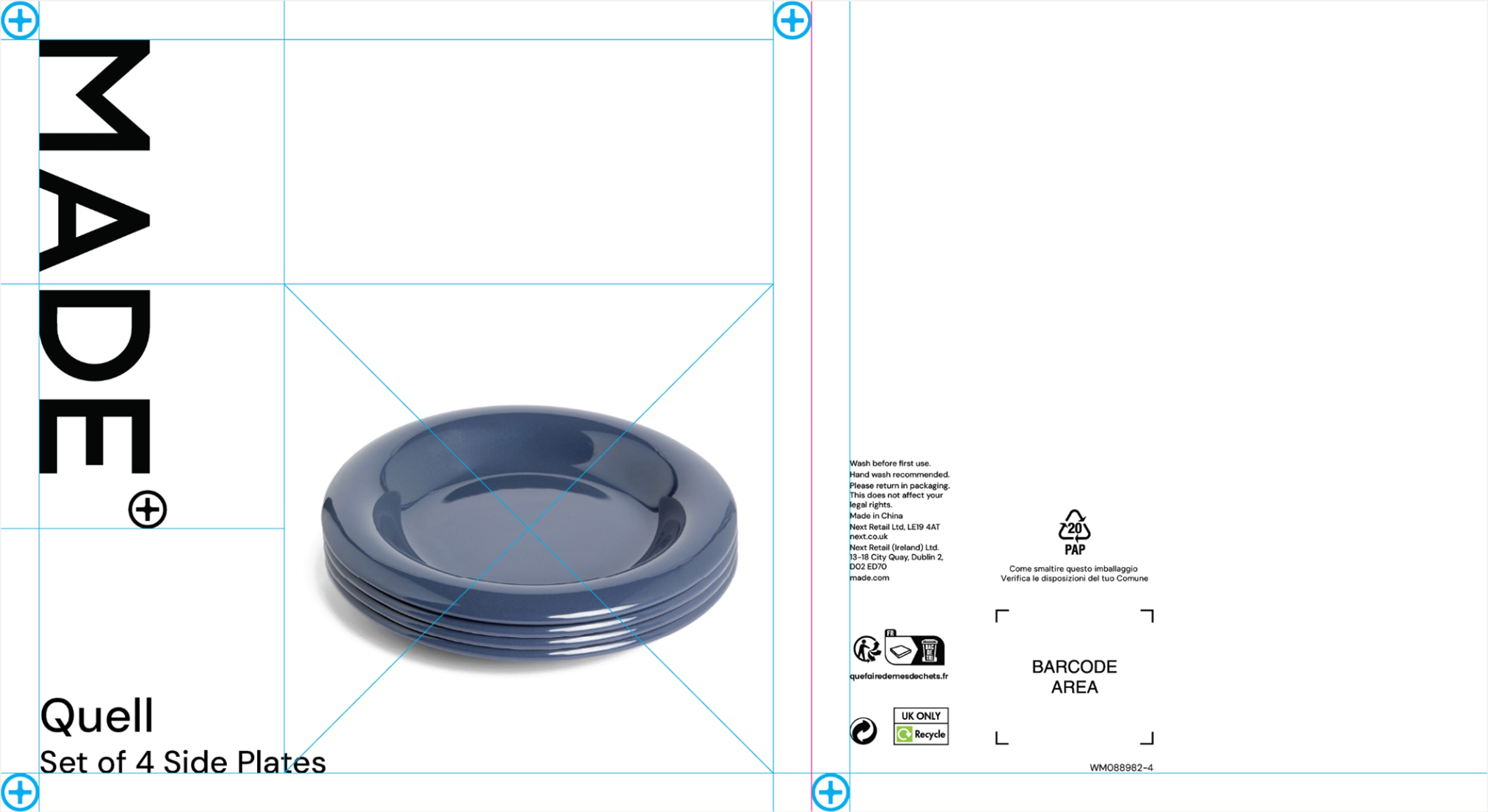
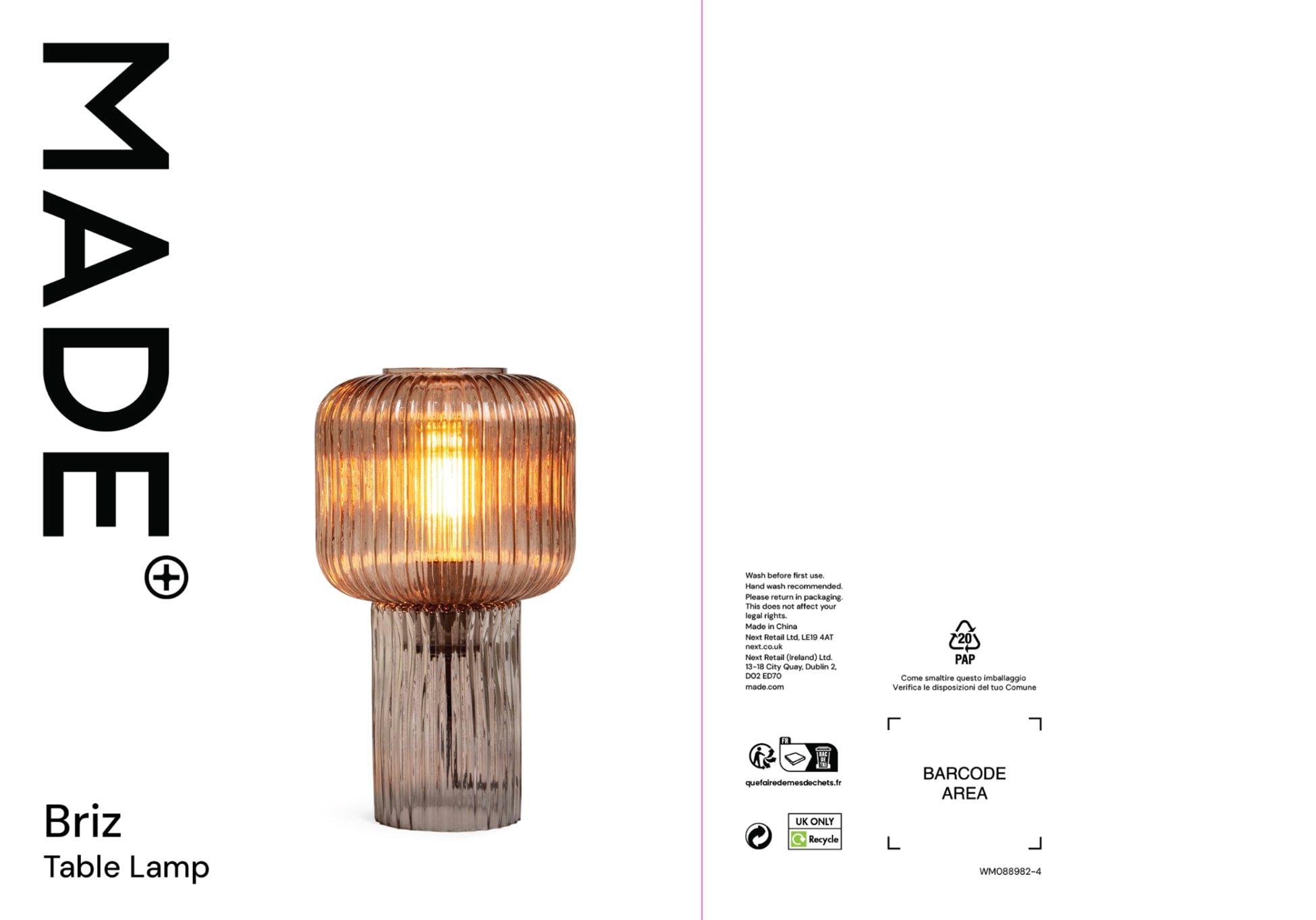
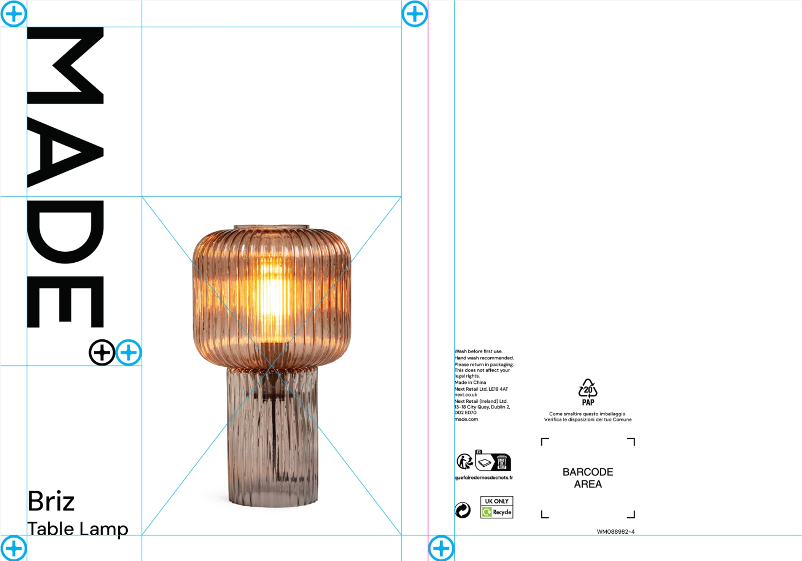
For OOH we put the logo at a 90° angle. Size is determined by thirds and outer padding is determined by the relative size of the icon.
Animation

Used typically on endframes, this animation portrays the character and fun nature of the Made brand.
Brand partnerships

Standardising how we sit visually amongst our friends.
Approved colour combinations
The below colour combinations are the only set approved. Please check legibility when used in smaller instances. Please also note that lime green is not permitted for use as a background colour.
In use
Our colour choice should be based on the imagery, either complimenting or clashing with the tone or mood of the creative.
DM Sans is a versatile typeface that strikes a perfect balance between strength and subtlety. Its simple, clear design allows it
to convey a sense of calm, while its rounded forms add a touch
of playfulness, making it adaptable for a wide range of applications.
We use two weights to display hierarchy, DM Sans Medium and Regular, they can be used separately and together in various ways. DM Sans Regular is used primarily for copy, sells and captions, while DM Sans Bold is used primarily for display and sub headings.
DM Sans Regular / Body copy
Kerning
For large headings, or anything over 120px in size, we should kern a little tighter than usual. This helps us keep things nice and connected and prevents our type looking disconnected. For all other headings and body copy, tracking should be kept optically standard.
Lineheight
For all headings, line-height (or leading), should be optically defined. For body copy, all leading should be set to 150% to ensure accessible reading.
Hierachy
Using the below system, we can create a consistent sense of hierachy across all channels. Using the default type setting for the creative (in this case 60px) we can multiply and divide by 1.5 to create consistent sizing increments.
Numbers
Bauhaus Soft Display adds a unique charm and warmth to the brand, infusing our campaigns with personality and approachability. Its rounded forms and playful aesthetics embody a sense of creativity and modernity, allowing us to connect more intimately with our audience.
Bauhaus Soft Display Light / Headings
Bauhaus Soft Display is used to make a bold impact as a heading typeface, thanks to its geometric forms and playful character. However, its distinctive style can make it challenging for extended text, which is why it is recommended solely for headings. To ensure optimal readability it will be complemented by our DM Sans typeface, which offers clean lines and clarity for body copy.
Kerning
For large headings, or anything over 120px in size, we should kern a little tighter than usual. This helps us keep things nice and connected and prevents our type looking disconnected.

For all other headings and body copy, tracking should be kept optically standard.
Numbers
CTA
We use DM Sans Regular Underlined for our CTAs across all channels to ensure our customers can easily take action.